
The navy blue shorts and the shirt that is not just white, but lilywhite, have survived many rebrands and sponsorship changes over the years, through the respective eras of Danny Blanchflower, Glenn Hoddle, Paul Gascoigne, Gareth Bale and now Harry Kane.
The relatively simple style of the home strip has given kit manufacturers a real opportunity to get creative, and what follows are the ten best home kits to ever grace N17…
10. The Original Tottenham Hotspur Football Club Kit (1884/85)
Tottenham Hotspur 1884-85 (Inc founder members) pic.twitter.com/emgSGPAhtY
— kevin hill (@kevhillsy) April 29, 2019
In their early days as the Hotspur Football Club, Spurs actually played in the inverse of their current kit, sporting navy blue shirts and white breeches.
The sartorial inspiration that followed came from an unlikely source - after cancelling a fixture to watch Blackburn Rovers beat Queen’s Park in the 1884 FA Cup final, Spurs accordingly adopted Rovers’ blue and white halved shirts.
While the light blue was last seen on Spurs’ 125th anniversary shirt in 2007, which mimicked this original, the lilywhite has endured ever since.
9. Nike (2019/20)

This has been Nike’s third consecutive season supplying Spurs’ kit, and they’ve finally got it bang on in terms of the home front with this simplistic, classic effort.
The previous two seasons had seen navy blue overused on the upper half of the kit, with 2018/19’s edition in particular looking like something you’d see when your printer breaks down.
Here, the navy blue plays a much more understated role on the sleeves and collar, with the lilywhite made to brilliantly stand out ahead of what Nike themselves unfortunately labelled a ‘new campaign full of optimism and ambition’.
8. Umbro (1951-1977)

Umbro took over as Spurs’ kit suppliers in 1935, and made a number of crucial changes to the kit during a 26-year association with the club, including the first modern use of yellow in a Spurs home kit (more on that later…)
While the basic kit template remained largely the same as Spurs entered the glory days of the 1960s, the famous cockerel on their badge managed to shed some pounds, bringing the crest closer to Spurs’ modern day insignia.
The retro shield badge has made a comeback in recent years, most recently in Nike 2017/18 kit.
7. Under Armour (2013/14)

One of the best periods of Spurs’ history was accompanied by some truly mediocre kits from the American sportswear giant, including the 2015/16 ‘seat belt’ kit (for when Spurs’ season crashed halfway through, ha ha!)
That being said, they ticked all the boxes in 2013/14, ironically when Spurs were playing some heinous football under Tim Sherwood.
Blue socks? Check. Throwing it back to the 90s with a striped collar? Check. And most importantly, an old friend in Hewlett-Packard as the sponsor instead of advertising insurance company AIA in (*shivers*) bright red? Check.
6. Adidas (2001/02)

There’s one word for this kit - stripes. Die Weltmarke Mit Den 3 Streifen went to town on stripes both vertical and horizontal here, but it somehow looked thoroughly in keeping with earlier kits.
This clean, geometrically-sound style is probably predominantly forgotten because of how abject the actual football was.
5. Puma (2009/z10)

It takes a brave designer to stick yellow in the Spurs kit, and a skilled one to make it work, and Puma get marks for doing both in one of their final Spurs kits.
Obviously, it helps that this kit is associated with thrashing Wigan 9-1, Gareth Bale’s breakout season and Crouchy at the Etihad, but also it’s eye-catching, without being garish, in a way that few Spurs kits have been since, with the yellow a subtle but striking border for the traditional colours.
4. Kappa (2005/06)

Yeah, fair enough, this shirt is deservedly haunted by lasagne, losing to Grimsby in the League Cup and Grzegorz Rasiak.
However, Kappa’s endeavours here are a prime example of how to get the navy blue talking, with a the darkened sleeves nicely complimenting the shirt’s simple, lilywhite torso.
Extra points for reversing the formula on the shorts with a classy white outline, in Kappa’s last outing before they rode off into the sunset to be replaced by Puma… come back soon guys!
3. Le Coq Sportif (1983-1985)

Now we’re getting to the big dogs, and Le Coq’s ingenious effort (which basically won Spurs the UEFA Cup, if you ask me) is a good starting point for multiple reasons.
Number one: The sheer AUDACITY of making a striped home shirt for a team that has traditionally played in the plainest of colours… and somehow pulling it off!
Number two: Spurs’ first, and most iconic sponsor making its debut on the shirt… remember the name, Holsten Pilsener.
2. Admiral (1977-1980)

With the funky Admiral logo darting in and out of the collar, sleeves and, most daringly, the outline of the shorts, this kit combines flair with the classic Spurs framework like (almost) no other,
In what is becoming a real theme, yet another nice kit ruined by how dreadful Spurs were at the time!
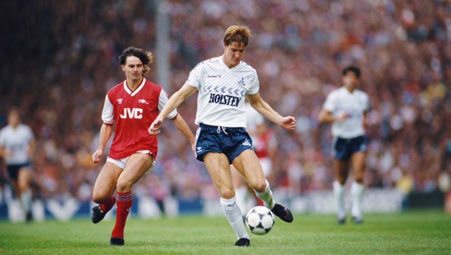
1. Hummel (1985-1987)
📖 Read all about the day when the great Diego Maradona played for Spurs: https://t.co/L9MwAFJBYZ #ThrowbackThursday pic.twitter.com/h8ALmKQvQB
— Tottenham Hotspur (@Spurs_India) August 4, 2016
It really is a mystery how Hummel aren’t supplying the great and the good of world football with their threads right now, because they really did put a shift in in the 1980s to create some of Spurs’ most memorable kits.
Clive Allen supplied the goals and Hummel supplied the panache in the best of these, where the dynamic chevrons which course throughout the strip convey the intensity of a football club competing for glory on multiple fronts.
Hummel refuse to see the shirt’s upper half as off limits too, risking sacrilege to thread diagonal stripes through the famous badge to create the ultimate image of a football club in motion.
Source : 90min